Defining Visual Branding

Visual branding is the strategic use of visual elements to create a cohesive and memorable brand experience. It’s more than just a logo; it encompasses all the visual aspects a company uses to communicate its identity and values to its target audience. A strong visual brand builds recognition, trust, and ultimately, customer loyalty.Visual branding and brand identity are intrinsically linked.
Brand identity is the overall personality, values, and mission of a company. Visual branding is the tangible manifestation of that identity, translating abstract concepts into a visual language that resonates with consumers. Essentially, brand identity is the “what” and visual branding is the “how”—how the brand communicates its essence visually.
Core Components of Effective Visual Branding
Effective visual branding relies on several key components working in harmony. These include the logo, color palette, typography, imagery, and overall visual style guide. The logo acts as the central visual identifier, while the color palette evokes specific emotions and associations. Typography contributes to readability and brand personality, and imagery helps to tell the brand’s story and connect with the audience.
A comprehensive style guide ensures consistency across all brand touchpoints.
Relationship Between Visual Branding and Brand Identity
A company’s visual branding must accurately reflect its brand identity. For instance, a luxury brand will employ sophisticated visuals, such as elegant typography and high-quality photography, to convey its premium positioning. Conversely, a tech startup might opt for a minimalist design with bold colors and modern fonts to project innovation and dynamism. The disconnect between visual branding and brand identity can lead to confusion and dilute brand messaging.
Examples of Strong and Weak Visual Branding
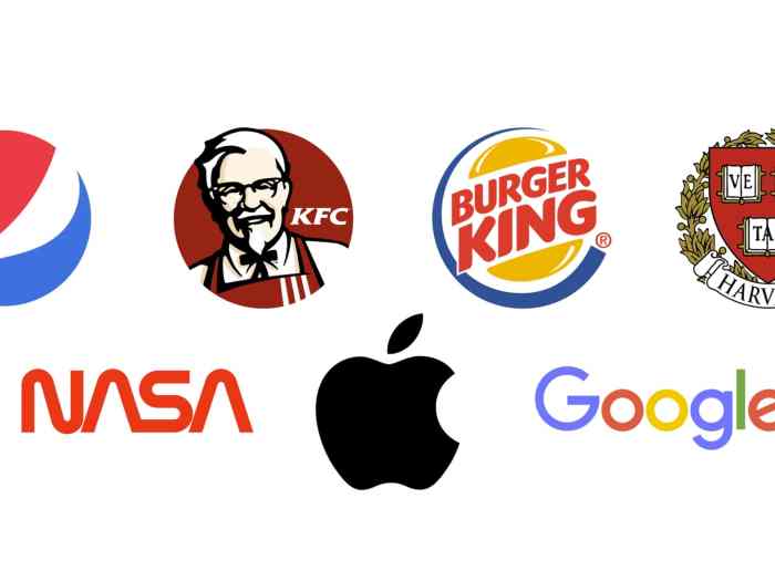
Apple is a prime example of strong visual branding. Its minimalist aesthetic, iconic logo, and consistent use of typography and imagery have created a globally recognized and highly valued brand. In contrast, a company with inconsistent visual elements, such as a poorly designed logo or clashing color palettes across different platforms, will struggle to establish a cohesive brand image. Imagine a company selling high-end organic food with a childish, cartoonish logo – the disconnect would be jarring and potentially damaging to its brand perception.
Comparison of Visual Branding Styles
| Style | Color Palette | Typography | Imagery |
|---|---|---|---|
| Minimalist | Limited, often monochromatic | Clean, simple fonts | Simple, uncluttered |
| Modern | Bold, vibrant, or sophisticated neutrals | Modern sans-serif fonts, often geometric | Clean lines, contemporary photography or illustrations |
| Vintage | Muted tones, earthy colors | Classic serif fonts, potentially hand-drawn elements | Retro imagery, aged textures |
| Rustic | Earthy tones, natural textures | Simple, slightly distressed fonts | Natural elements, wood, stone, etc. |
The Role of Color in Visual Branding
Color is far more than just an aesthetic choice in visual branding; it’s a powerful tool that significantly impacts how consumers perceive a brand. The strategic use of color can evoke specific emotions, build brand recognition, and ultimately influence purchasing decisions. Understanding the psychology of color and its application is crucial for creating a compelling and memorable brand identity.Color Psychology and Brand PerceptionDifferent colors elicit diverse emotional responses.
For instance, blues often convey trust and stability, making them popular choices for financial institutions. Reds, on the other hand, tend to stimulate excitement and urgency, often used in fast-food or sale promotions. Greens are associated with nature and health, frequently employed by environmentally conscious brands. Understanding these associations allows brands to carefully curate a color palette that aligns with their desired brand personality and target audience.
Color Palettes for Different Company Types
The following three color palettes demonstrate how diverse color combinations can effectively represent different brand identities.
- Tech Startup: A palette featuring a vibrant teal (#008080), a bright orange (#FFA500), and a clean white (#FFFFFF). The teal represents innovation and technology, while the orange adds a playful, energetic touch, suggesting dynamism and forward-thinking. White provides balance and clarity, ensuring readability and a modern feel. This combination is energetic and memorable, appealing to a younger, tech-savvy demographic.
- Luxury Brand: A sophisticated palette incorporating a deep emerald green (#006400), a rich burgundy (#800020), and a creamy off-white (#F5F5DC). The emerald green suggests luxury and exclusivity, while the burgundy adds a touch of opulence and sophistication. The off-white provides a neutral backdrop that elevates the other colors, enhancing their richness and creating a sense of timeless elegance. This palette projects high-end quality and timeless appeal.
- Non-profit Organization: A calming palette consisting of a soft sky blue (#87CEEB), a gentle sage green (#8FBC8F), and a warm, light beige (#F5F5DC). The sky blue evokes feelings of trust and serenity, while the sage green represents growth and harmony. The light beige adds a touch of warmth and approachability, creating a friendly and reassuring visual identity. This palette inspires confidence and trustworthiness, aligning with the values of many non-profit organizations.
Color Consistency Across Brand Materials
Maintaining consistent color usage across all brand materials—from logos and websites to marketing collateral and social media—is paramount. Inconsistency can dilute brand recognition and create a fragmented brand image. A well-defined brand style guide, specifying exact color codes (e.g., using HEX or Pantone values), is essential to ensure uniformity and prevent variations in color reproduction across different platforms and mediums.
Examples of Effective Color Usage in Visual Branding
Consider the iconic Tiffany & Co. blue. This unique shade, known as “Tiffany Blue,” is so closely associated with the brand that it’s almost instantly recognizable. The consistent use of this color across all its marketing materials has created a powerful and enduring brand identity. Similarly, Coca-Cola’s red is instantly recognizable and evokes feelings of happiness and energy.
The strategic use of a single, dominant color, consistently applied, has created an exceptionally strong brand association. These examples illustrate the power of color consistency and strategic color selection in building brand recognition and loyalty.
Typography and Visual Branding
Typography plays a crucial role in visual branding, subtly influencing how a brand is perceived and ultimately impacting its success. A well-chosen typeface can communicate a brand’s personality and values effectively, while a poorly chosen one can undermine the entire visual identity. The right typography ensures readability, reinforces brand messaging, and contributes to an overall cohesive and memorable brand experience.
Different font styles possess distinct characteristics that align with various brand personalities. Serif fonts, with their small decorative flourishes at the ends of strokes, often project a sense of tradition, sophistication, and trustworthiness. Sans-serif fonts, lacking these flourishes, tend to convey modernity, minimalism, and cleanliness. Script fonts, mimicking handwriting, evoke feelings of elegance, personality, and artistry. Display fonts, often highly stylized, are best used sparingly for headlines or logos to create impact and memorability.
The selection should always consider the target audience and the brand’s desired message.
Font Styles and Brand Personality Suitability
The selection of a typeface is not arbitrary; it directly contributes to the perception of a brand. Consider these examples: A law firm might choose a serif font to project authority and trustworthiness, while a tech startup might opt for a clean sans-serif font to communicate innovation and modernity. A luxury fashion brand might use a script font to suggest elegance and sophistication, while a children’s toy company might use a playful display font to appeal to its target audience.
The key is to select fonts that resonate with the brand’s identity and values.
| Font Style | Brand Personality | Example Brands (Illustrative) |
|---|---|---|
| Serif | Traditional, Sophisticated, Trustworthy | Times New Roman (historically associated with newspapers, conveying reliability), Law firms, Financial institutions |
| Sans-serif | Modern, Clean, Minimalist | Google (clean and approachable), Many tech companies, Modern design firms |
| Script | Elegant, Artistic, Personalized | Luxury fashion brands, Calligraphy studios, High-end restaurants |
| Display | Bold, Unique, Attention-grabbing | Used sparingly in logos and headlines; Comic Sans (used playfully, though often criticized for its overuse), Circus posters |
Typography Best Practices for Visual Consistency and Readability
Maintaining visual consistency and readability is paramount for effective typography. Inconsistency can create confusion and detract from the overall brand experience. The following best practices ensure a cohesive and easily digestible visual message.
- Limit the number of fonts used: Typically, two or three fonts are sufficient – one for body text, one for headings, and possibly one for display purposes.
- Maintain consistent font sizes and weights: Use a hierarchical structure for headings and body text to guide the reader’s eye. Avoid jarring size transitions.
- Ensure sufficient spacing between lines (leading) and characters (kerning): Adequate spacing improves readability and prevents text from appearing cramped.
- Choose fonts with high readability: Avoid overly decorative or difficult-to-read fonts, especially for large amounts of text.
- Consider accessibility: Select fonts that are easily readable for people with visual impairments.
- Maintain consistent capitalization: Establish a clear style guide for capitalization (e.g., sentence case, title case).
Examples of Brands Effectively Using Typography
Many successful brands effectively leverage typography to reinforce their message and create a strong visual identity. For example, Coca-Cola’s iconic Spencerian script font evokes a sense of nostalgia and tradition, while the minimalist sans-serif font used by Apple conveys a sense of modern simplicity and elegance. The contrasting approaches reflect the unique identities of each brand. These are not simply aesthetic choices; they are integral to the overall brand strategy.
Sample Typography Scheme for a Hypothetical Company
Let’s consider a hypothetical sustainable coffee company called “Bean & Bloom.” Their brand personality is ethical, natural, and approachable. To reflect this, we could use the following typography scheme:
- Heading Font: Playfair Display (serif) – This font offers a touch of elegance and sophistication, suggesting quality and care, without being overly formal.
- Body Font: Lato (sans-serif) – Lato is clean, modern, and highly readable, perfect for body text and ensuring accessibility.
- Accent Font (for small details): Great Vibes (script) – Used sparingly for elements like small illustrations or quotes, it adds a touch of handcrafted charm that aligns with the brand’s sustainable ethos.
This combination provides a balanced and visually appealing typography system that effectively communicates “Bean & Bloom’s” brand personality.